Md. Mutaher Hossain

Nishchinte Delivery

UI-UX case study for parcel delivery app
Role

UI-UX Design

Project Type

Passion Project

Project Duration

Nov 2021 - Dec 2021

Project overview
Nishchinte delivery solution is designed to provide hassle less delivery service to help its user to deliver their products safely and quickly with transparent delivery process for both the merchant and their customer.
Why designing this app?
Finding problems
  • Used several delivery services and found that many of them don’t have any mobile apps for their services.
  • Few company has mobile apps which I found lacks some ux issues.
  • Good services needs to keep the process transparent so that user can trust on them.
  • In the covid-19 pandemic when everyone prefer online order and better delivery service, importance of parcel deivery is rapidly growing.
How this will help?
Designing Solutions
  • This app provides features that covers personal users to business users and it would allow users to have a complete parcel delivery experience from pickup to delivery.
  • For business owners, this app provides parcel and payment updates which helps to keep track of every parcel.
  • Navigating through the app would be very easy for any users as it only takes few clicks to request for a pickup.
  • This app also help parcel receiver by sending messages of parcel status and live tracking.
Design process
I followed an iterative User Centered Design process to design this app. Users are at the center in this process and had to focus on the users need in every step. Full process is given below.
Empathize
User Research
I conducted interviews to understand users and found eCommerce business owners are the primary user who use 3rd party delivery services to deliver goods to their customers.

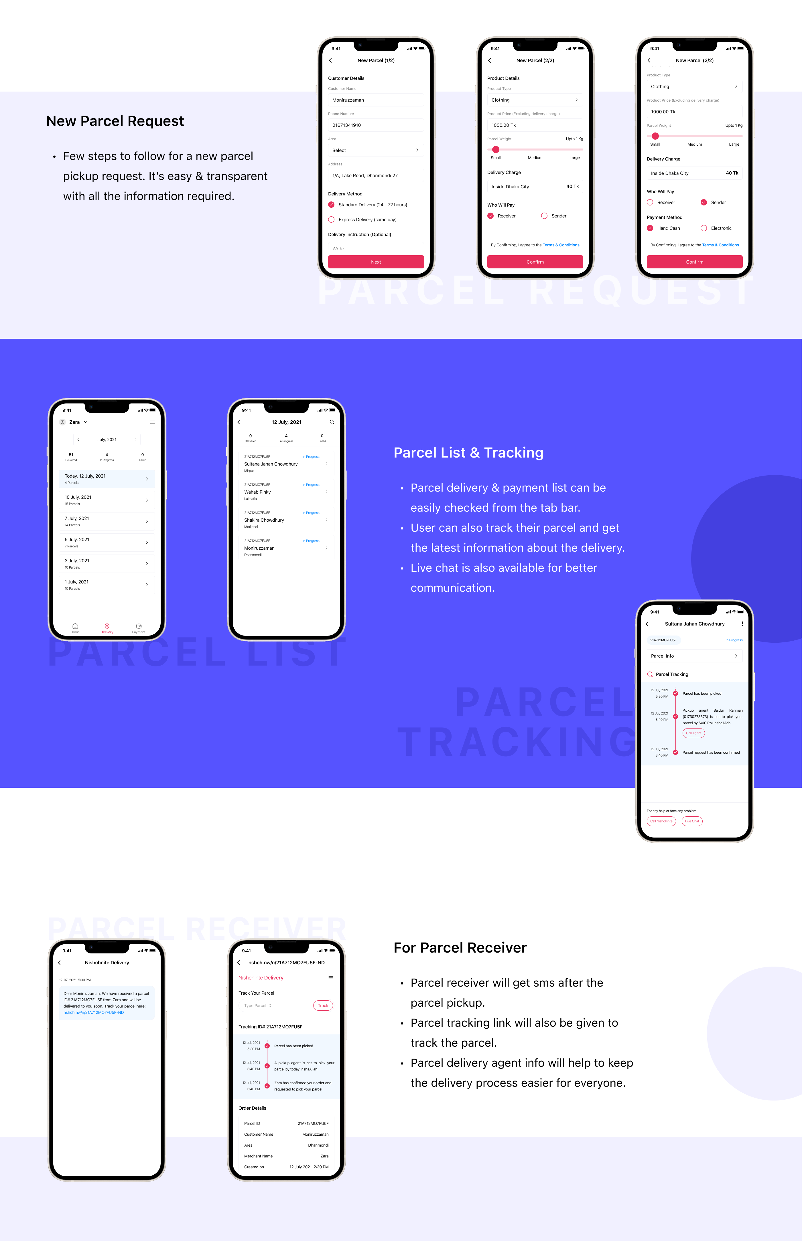
User interviews made it clear that there is issue with pickup goods from seller as they don’t have any tracking or much information when delivery company is going to pick the parcel. So there is a communication gap between seller and delivery company.

Secondary user group are those who want to send products or documents to someone else.

In this user research, I also found that parcel receiver’s experience is also bad with existing delivery services. They can’t track their product and don’t have any information about the product status.

These information helps to prepare the goals and design strategy to design this app.
Competitor Research
Define
Pain Points
Time
Users are too busy to spend a lot of time to contact with delivery company to know about parcel pickup/delivery info.
Price
When selecting a particular delivery area, app doesn’t shows the delivery charge on the screen. Users don’t want to open delivery price list every time.
Reiteration
Repetitive action to provide fixed data lower the customer experience. Users don’t want to give similar information every time they register for a new parcel.
Solution
Create a convenient application where the parcel status will be updated automatically and user can check whenever they want.
Solution
Introduce a convenient feature to display area wise delivery charge on the screen. Users should not be confused.
Solution
Design and build an application where users data is stored safely and used for users own purpose when needed.
Persona
User Journey Map
Goal: Register new parcel to deliver goods to customer
User Flow
Ideate
Mind Maping
Storyboarding
Design
Paper Wireframes
After ideation, I did some concept sketches at the beginning of the design process. This realy helped me to visualize the final product and made things easier to iterate where needed. Here are some of them-
Digital Wireframes & Prototype
I turned my sketches into digital wireframes with Figma. Then created the prototype and tested remotely.
Findings:
Selecting multiple accounts is confusing as a drop down arrow is missing.
In the live tracking page, parcel status is missing.
User was asking for delivery charge list to be shown.

Solutions:
A drop down arrow is added.
Parcel status is shown in the live tracking page.
Delivery charge list is added in the drawer menu.
Visual Digital
After few more iterations, I designed the final screens with Figma. I conducted A/B testing as well during the process.

My goal was to make the product clean and easy to use that will delight the user and solve their problems quickly.

I also focused on the color scheme to give the product a strong look which will help transmit trust and reliability.
Onboarding
First time opening of the app will provide -
  • Summarization of features
  • Quick overview
Verification & Registration
Simple & easy way to verify & register -
  • Insert mobile number
  • Provide OTP code
  • Fill up basic information
  • Secure account
Home
  • Simplified home screen with parcel request option at the center
  • Tab bar at the bottom allows user to check delivery & payment status easily
Multiple Account
  • Multiple account concept is a newly introduced feature in a delivery app which will help our user to maintain several businesses.
Pickup Status
  • Pickup agent info helps our user for better communication & to make the pickup easier & faster.
New Parcel Request
  • Few steps to follow for a new parcel pickup request. It’s easy & transparent with all the information required.
Parcel List & Tracking
  • Parcel delivery & payment list can be easily checked from the tab bar.
  • User can also track their parcel and get the latest information about the delivery.
  • Live chat is also available for better communication.
For Parcel Receiver
  • Parcel receiver will get sms after the parcel pickup.
  • Parcel tracking link will also be given to track the parcel.
  • Parcel delivery agent info will help to keep the delivery process easier for everyone.
Wrapping Up
Things I have learned from this project
  • Users are the center in any app designing strategy and it is not easier to design app without their feedback. It would be more helpful for me if I could ask more users and get to know their experiences during the research phase.
  • I had few opportunities to test this app remotely and the feedback I received helped me to minimize complexity. But this was not enough and I will try my best to get as many feedback as possible in the next project to make the design more intuitive & user friendly.
PreviewEmpathiseDefineIdateDesignVisual Design 1Visual Design 2Visual Design 3Wrapping Up

Up next

Online Education
EduLine
UI-UX | Web Design
Lorem ipsum dolor sit amet, consectetur adipiscing elit. Suspendisse varius enim in eros elementum tristique. Duis cursus, mi quis viverra ornare, eros dolor interdum nulla.
View Project

Up next

Design Resources
Icon Bundle
UI-UX | Iconography | Symbols
Icons can add so much personality to even the most minimalist designs. I designed this custom icon bundle for mastering the use of icons that enhance user experience.
free Resources in Figma